RESTOBRANDS
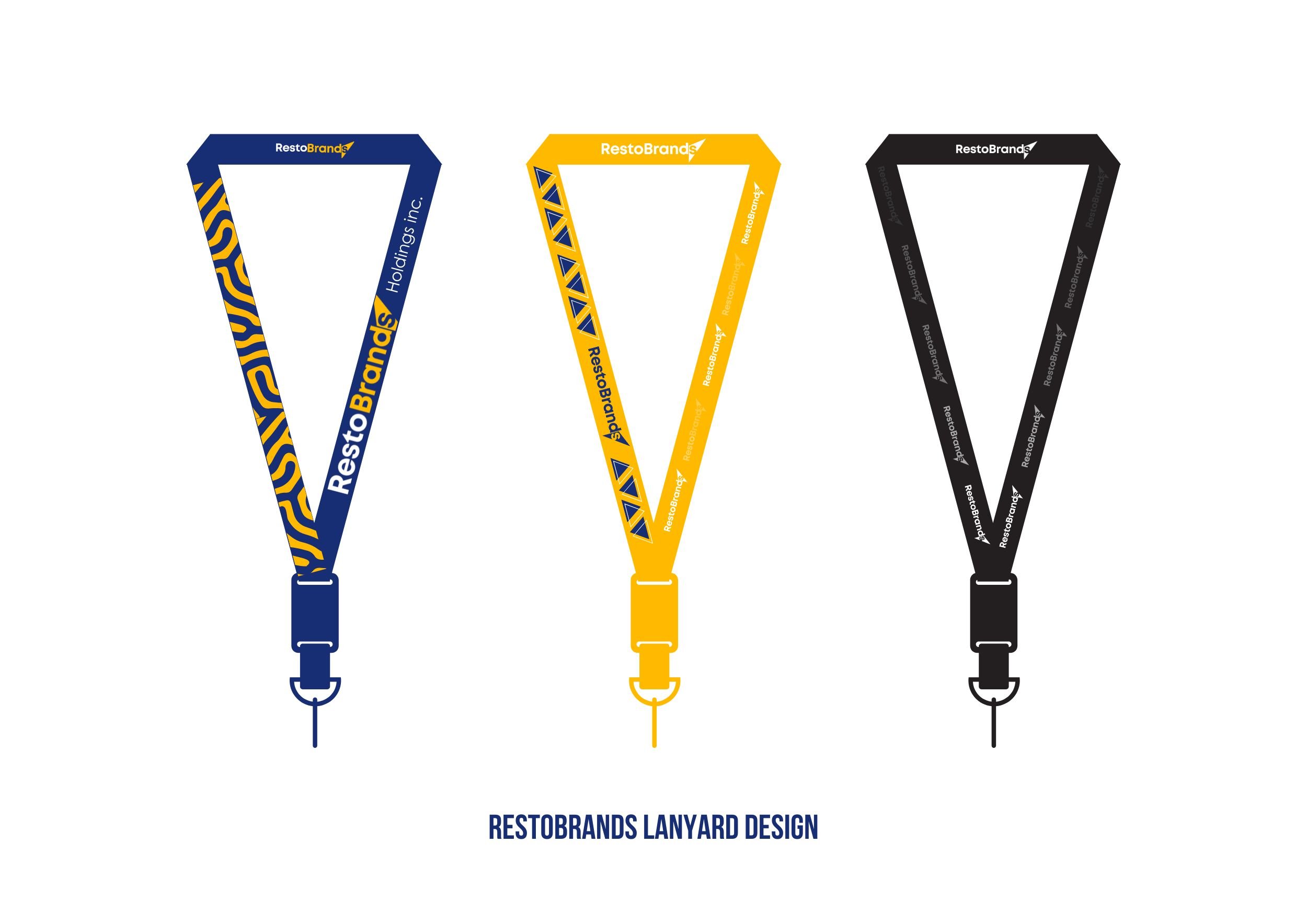
Our branding project with RestoBrands encompasses a comprehensive suite of design and branding elements tailored to establish and reinforce their identity in the competitive franchising market.
Logo Design: The RestoBrands logo features a modern and dynamic design, integrating bold colors and sharp graphics that symbolize the company’s innovative and forward-thinking approach.
Business Card & Letterhead: These essential business materials have been designed to maintain consistency with the logo’s color scheme and styling, ensuring a professional appearance and brand coherence across all physical correspondence.
Brand Guide: A detailed brand guide was developed to outline the usage of the logo, color palette, typography, and other visual and communicational guidelines. This document serves as a roadmap for all branding efforts, ensuring consistency across various media.
Color Palette: The chosen colors reflect the brand’s ethos, with a combination of vibrant and professional tones that stand out in visual communications and marketing materials.
Fonts: We selected fonts that complement the logo’s character, opting for a combination of League Spartan for headings and Century Gothic for body text, balancing readability with contemporary aesthetics.
Online Branding: The online branding extends the visual identity into the digital realm, ensuring that the website, social media, and all online content reflect the uniformity and professionalism of the brand through consistent use of logos, colors, and typography.
This cohesive branding project not only enhances RestoBrands’ visual appeal but also strengthens its market presence by providing a clear and consistent brand message across all touchpoints.


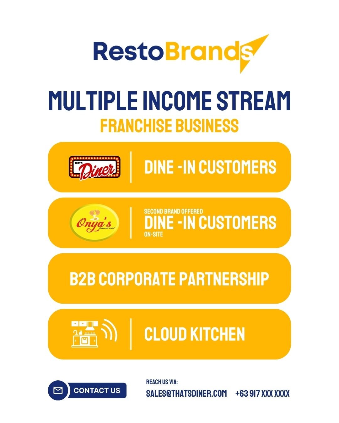
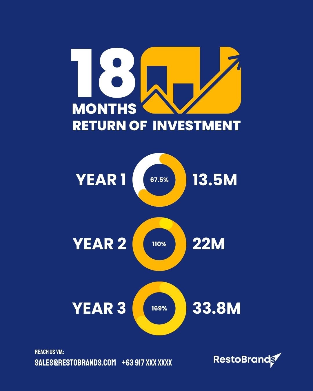
Social Media Posts


