Scope
-
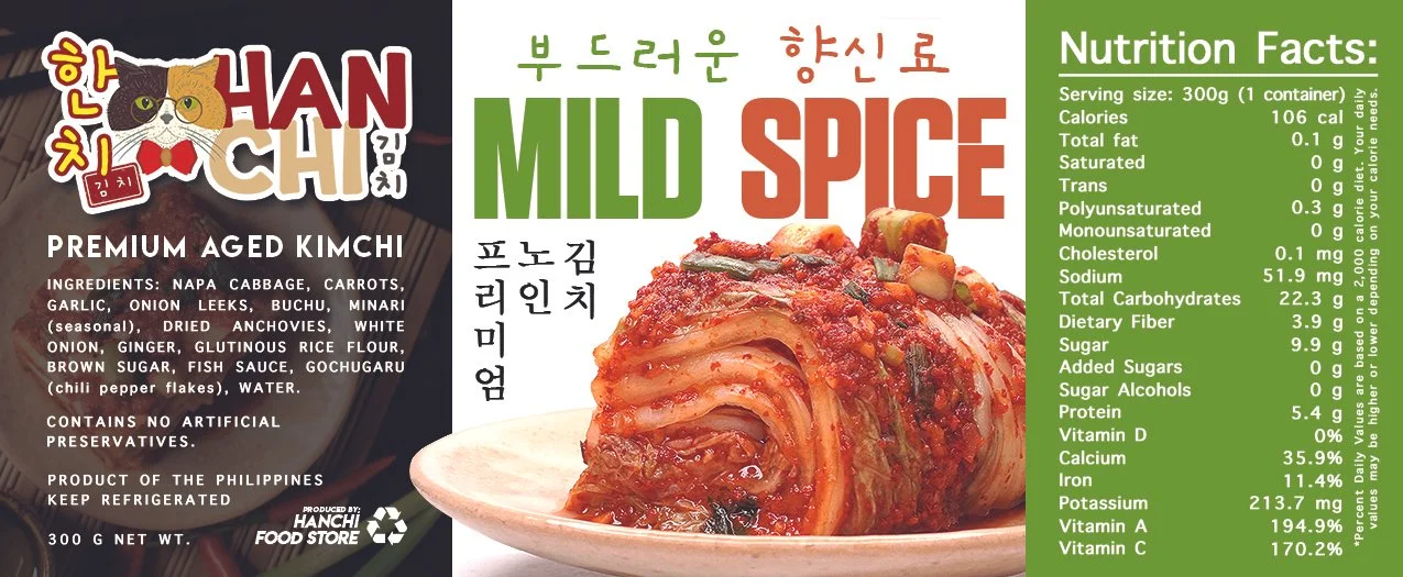
The logo design for Hanchi Kimchi was crafted with great attention to both the story behind the brand name and the unique elements that make it memorable. The name "HanChi" is a meaningful fusion of "Hannah" and "Chino," representing the partnership that inspired this concept.
Hannah’s love for cats served as the core inspiration for the visual identity, giving rise to the feline character at the heart of the logo. The cat itself is not only a reflection of her affection for animals but also adds a personal and approachable touch to the brand. The design captures the distinctive features of a two-toned calico cat, characterized by contrasting fur patterns—a subtle nod to individuality and uniqueness.
Chino’s iconic round glasses are thoughtfully integrated into the logo, adding a layer of sophistication and identity. The glasses represent Chino’s persona and anchor the character in the brand’s playful yet professional tone.
The addition of Korean characters in bold and clean typography enhances the cultural authenticity, while the red name stamp (with 김치 or "kimchi" written inside) adds a traditional touch, reinforcing the Korean culinary theme.
The cat’s bow tie brings an elegant finish to the design, embodying a mix of fun and refinement, perfectly aligning with the brand’s vision. The result is a striking and whimsical logo that effortlessly communicates Hanchi Kimchi's vibrant personality and cultural roots.
-
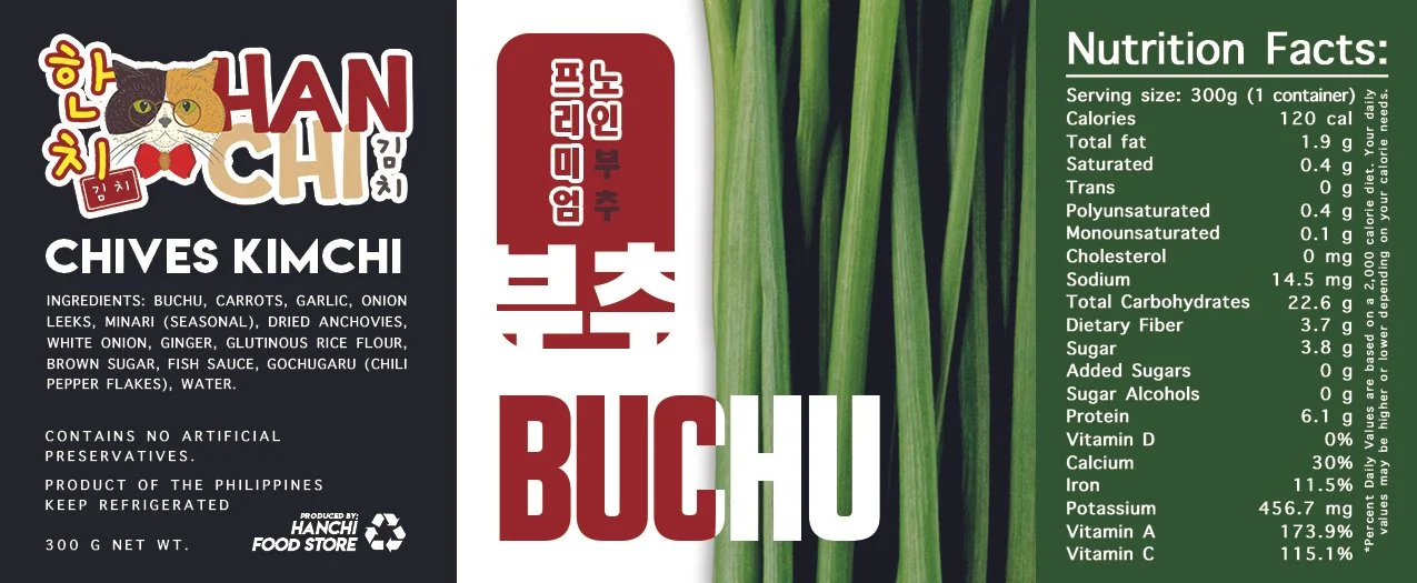
The brand design process for Hanchi Kimchi focused on creating a cohesive identity that reflects the premium quality of the product while also appealing to a younger, trend-conscious audience. The packaging design is central to this effort, combining elements that speak to both tradition and modernity, resonating with fans of Korean pop culture.
Packaging Design:
The jar was chosen deliberately to symbolize the premium, artisanal nature of the product. A clear, airtight mason jar highlights the vibrant colors and textures of the kimchi, making the product itself a visual focal point. This transparency communicates trust and quality, allowing customers to see exactly what they’re getting. The jar also aligns with a modern, eco-conscious audience, emphasizing reusability and sustainability.
Fonts and Typography:
The font selection for Hanchi Kimchi blends both Korean and modern typefaces to create a unique balance of tradition and youth. The primary font used for the Korean characters is clean and bold, giving it a sense of reliability and heritage, while the English typeface for “Kimchi” is simple, modern, and approachable. The combination ensures legibility while reinforcing the brand’s high-end positioning. The fonts reflect a premium but updated aesthetic, connecting with younger generations who appreciate minimalist and sleek design trends.
Color Palette:
The color scheme was carefully curated to communicate freshness and authenticity. The rich reds and deep oranges mirror the natural hues of kimchi, evoking the bold flavors within. These colors are balanced with earthy tones like greens and browns, grounding the brand in natural, organic roots. The accents of yellow add a pop of youthful energy, in line with contemporary Korean pop culture, making the design feel approachable and lively while retaining its premium feel.
Brand Voice:
Hanchi Kimchi’s brand voice is a blend of authenticity and vibrancy. It emphasizes high quality and heritage while also speaking in a playful, engaging tone that resonates with a younger, trend-aware audience. The language used in packaging and promotions is confident but not pretentious, inviting customers to enjoy the rich, traditional flavors of kimchi with a modern twist. Descriptive tags like “Premium Aged” and “Authentic Recipe” reinforce the product’s premium positioning, while playful language, such as describing spice levels or pairing suggestions, adds a contemporary touch.
Overall, the design reflects Hanchi Kimchi’s commitment to offering a top-tier, authentic product while connecting with younger generations through modern design and playful brand storytelling. The balance between the traditional craftsmanship of kimchi and modern visual elements allows Hanchi Kimchi to stand out in a crowded marketplace as a premium yet accessible brand.
-
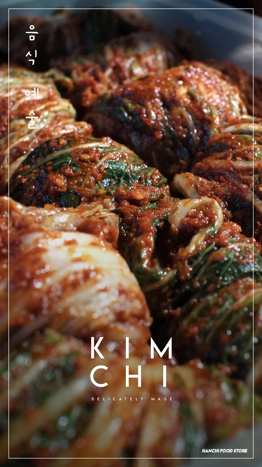
The photography process for Hanchi Kimchi was designed with a meticulous eye for detail, utilizing low-key lighting techniques to create a dark, moody, and refined aesthetic. This approach caters to a discerning clientele, foodies who value the artistry behind artisanal food and are willing to invest in a premium product. By employing controlled lighting, we draw attention to the texture and depth of the kimchi’s rich layers and colors, creating an image that feels luxurious and evokes a sense of craftsmanship.
Low-Key Lighting:
In this shoot, the low-key lighting emphasizes shadows and contrast, providing an intimate and almost cinematic appeal to the product. The light is carefully directed to highlight the vibrant reds and oranges of the kimchi, making the colors pop against the dark background. The moody ambiance created by this lighting technique ensures that the product stands out in a sophisticated and artful way. The goal is to communicate that Hanchi Kimchi is more than just food—it’s an experience, crafted with the utmost care and attention to detail.
Targeting Premium Sensibilities:
This photography style appeals to high-end consumers who are looking for products that reflect quality, authenticity, and tradition. The moody tone adds a sense of exclusivity, differentiating Hanchi Kimchi from mass-produced supermarket brands or homemade varieties. By focusing on the intricate details of the product—the glistening layers of napa cabbage and the coarse grind of the chili paste—we’re visually reinforcing the artisanal nature of the kimchi. This attention to detail appeals to food lovers who appreciate the complexity of flavors and are willing to pay a premium for such craftsmanship.
Brand Alignment:
The overall aesthetic aligns with the brand’s premium positioning, combining traditional Korean food heritage with modern presentation. The dark and moody photography elevates the product to something more akin to fine art, positioning Hanchi Kimchi as a luxury offering. The imagery sends a strong message: this is kimchi for those who not only understand its cultural importance but also seek out the highest quality version of it, much like sourcing a fine wine or gourmet cheese.
This photography style isn’t just about capturing the product—it’s about telling a story of heritage, craftsmanship, and exclusivity. Each shot becomes a visual invitation to appreciate the art of kimchi-making, making it clear that Hanchi Kimchi stands above the competition as a premium, artisanal brand.
-
The social media management for Hanchi Kimchi was crafted with a strategic focus on blending the brand’s premium identity with the vibrant appeal of Korean pop culture. Our approach combined visually captivating ads with engaging video content to build brand awareness, attract young food enthusiasts, and showcase the versatility of kimchi in everyday meals.
Korean Pop Culture-Inspired Ads:
To tap into the global popularity of Korean culture, we designed ad campaigns that resonate with fans of K-pop, Korean dramas, and Korean culinary traditions. The ads used bold, youthful colors and dynamic graphics reminiscent of K-dramas, creating a fun and energetic atmosphere. These ads were distributed across platforms like Instagram, Facebook, and TikTok, where the target demographic actively engages with pop culture content.
We also strategically timed some ads to coincide with events in the K-pop world or new K-drama releases, riding on the waves of viral trends to ensure maximum reach and engagement. This allowed Hanchi Kimchi to stay top-of-mind as the go-to brand for those looking to bring a slice of Korea into their kitchens.
Video Content: Daily Menu Integration:
To further build Hanchi Kimchi’s brand presence, we created video content showcasing how easily the product can be incorporated into everyday meals. These videos were designed to be both aspirational and practical, demonstrating that even though Hanchi Kimchi is a premium product, it can seamlessly fit into anyone's daily routine.
Each video featured quick, easy-to-follow recipes such as kimchi fried rice, kimchi jjigae, and kimchi on hotdog buns, emphasizing the versatility of the product. By presenting Hanchi Kimchi as not only a side dish but a key ingredient that elevates ordinary meals, we highlighted its value and relevance in modern cooking.
Through this holistic social media management approach, we were able to elevate Hanchi Kimchi’s presence in the digital space, marrying the brand’s premium identity with the dynamic, youth-driven energy of Korean pop culture. The combination of visually striking ads and relatable, practical video content positioned Hanchi Kimchi as both a high-quality product and a staple for modern, everyday cooking.


